Code
rcdat <- read_csv("Data/Derived/ReddCounts_WGFD_1971-2021_cleaned_withFlowTempCovariates_SeparateFlowComponents_age0.csv") %>% filter(!is.na(reddsperkm)) %>% select(year)
rcsum <- read_csv("ReddCounts_DataSummary.csv")Purpose: Explore covariate time series data data - trends and step-changes in environmental variables describing climate and dam management.
Redd count data to get years for rug marks
rcdat <- read_csv("Data/Derived/ReddCounts_WGFD_1971-2021_cleaned_withFlowTempCovariates_SeparateFlowComponents_age0.csv") %>% filter(!is.na(reddsperkm)) %>% select(year)
rcsum <- read_csv("ReddCounts_DataSummary.csv")Covariate data
jldramp <- read_csv("Data/Derived/JLD_RampDown_Summary_CalendarYear_1960-2022.csv") #%>% rename(broodyr = year)
jldflow <- read_csv("Data/Derived/JLD_ManagedFlow_Covariates_BroodYear_1960-2022.csv")
natflow <- read_csv("Data/Derived/SnakeTribs_NaturalFlow_Covariates_BroodYear_1960-2022.csv") %>% rename(flowstn = site) %>% filter(flowstn %in% c("SnakeBeFlat", "SnakeNat"))
airtemp <- read_csv("Data/Derived/AirTemperature_Covariates_BroodYear_1960-2022.csv") %>% filter(site %in% c("moose")) %>% rename(tempstn = site)
Misc.
# color palette
mycols <- c("#E69F00", "#56B4E9", "#009E73", "#999999")

# covariate names
names.covars.new <- c("Duration of ramp down",
                      "Timing of ramp down",
                      "Mgd. winter flow variation",
                      "Mgd. summer mean flow",
                      "Mgd. peak flow mag. (0)",
                      "Mgd. peak flow mag. (1)",
                      "Mgd. peak flow timing",
                      "Nat. peak flow magnitude",
                      "Nat. peak flow timing",
                      "Autumn temperature",
                      "Winter temperature",
                      "Spring temperature",
                      "Summer temperature",
"Mgd. x Nat. peak flow timing")plotlist <- list()Test for change before/after 1989
pre <- unlist(jldramp %>% filter(broodyr < 1989) %>% select(jld_rampdur))
post <- unlist(jldramp %>% filter(broodyr >= 1989) %>% select(jld_rampdur))
prepost <- tibble(period = factor(c(rep("pre", times = length(pre)), rep("post", times = length(post))), levels = c("pre", "post")),
                  value = c(unlist(pre), unlist(post)))
t.test(pre, post, alternative = "two.sided")
    Welch Two Sample t-test

data:  pre and post
t = 1.3686, df = 36.044, p-value = 0.1796
alternative hypothesis: true difference in means is not equal to 0
95 percent confidence interval:
 -0.9841648  5.0693575
sample estimates:
mean of x mean of y
10.689655 8.647059 var.test(pre, post, alternative = "two.sided")
    F test to compare two variances

data:  pre and post
F = 5.898, num df = 28, denom df = 33, p-value = 2.834e-06
alternative hypothesis: true ratio of variances is not equal to 1
95 percent confidence interval:
  2.885426 12.321171
sample estimates:
ratio of variances
           5.89802
Create plot
plotlist[[1]] <- eval(substitute(ggplot() +
  geom_point(data = jldramp, mapping = aes(x = broodyr, y = jld_rampdur), shape = 16) +
  geom_line(data = jldramp, mapping = aes(x = broodyr, y = jld_rampdur)) +
  geom_ysideboxplot(data = prepost, mapping = aes(x = period, y = value), orientation = "x", fill = "grey80") +
  xlab("Year") + ylab("Duration of ramp down (days)") +
  geom_rug(data = rcdat, mapping = aes(x = jitter(year, factor = 1.5))) +
  geom_vline(xintercept = 1989, color = "red", linetype = "dashed", linewidth = 0.7) +
  geom_vline(xintercept = 1996, color = "grey50", linetype = "dashed") +
  theme_bw() +
  theme(panel.grid = element_blank(), axis.text = element_text(color = "black"),
        panel.border = element_rect(color = mycols[1], fill = NA, linewidth = 2),
        ggside.panel.border = element_blank(), ggside.axis.text = element_blank(),
ggside.axis.ticks = element_blank(), axis.text.y = element_text(angle = 90, hjust = 0.5, vjust = 0.5))))Test for change before/after 1989
pre <- unlist(jldramp %>% filter(broodyr < 1989) %>% select(jld_rampratemindoy))
post <- unlist(jldramp %>% filter(broodyr >= 1989) %>% select(jld_rampratemindoy))
prepost <- tibble(period = factor(c(rep("pre", times = length(pre)), rep("post", times = length(post))), levels = c("pre", "post")),
                  value = c(unlist(pre), unlist(post)))
t.test(pre, post, alternative = "two.sided")
    Welch Two Sample t-test

data:  pre and post
t = -5.1168, df = 31.432, p-value = 1.482e-05
alternative hypothesis: true difference in means is not equal to 0
95 percent confidence interval:
 -13.622019  -5.860739
sample estimates:
mean of x mean of y
264.7586 274.5000 var.test(pre, post, alternative = "two.sided")
    F test to compare two variances

data:  pre and post
F = 13.938, num df = 28, denom df = 33, p-value = 3.494e-11
alternative hypothesis: true ratio of variances is not equal to 1
95 percent confidence interval:
  6.818913 29.117712
sample estimates:
ratio of variances
          13.93836
Create plot
plotlist[[2]] <- eval(substitute(ggplot() +
  geom_point(data = jldramp, mapping = aes(x = broodyr, y = jld_rampratemindoy), shape = 16) +
  geom_line(data = jldramp, mapping = aes(x = broodyr, y = jld_rampratemindoy)) +
  geom_ysideboxplot(data = prepost, mapping = aes(x = period, y = value), orientation = "x", fill = "grey80") +
  xlab("Year") + ylab("Timing of ramp down") +
  geom_rug(data = rcdat, mapping = aes(x = jitter(year, factor = 1.5))) +
  geom_vline(xintercept = 1989, color = "red", linetype = "dashed", linewidth = 0.7) +
  geom_vline(xintercept = 1996, color = "grey50", linetype = "dashed") +
  scale_y_continuous(breaks = c(245, 254, 264, 274, 284), labels = c("1 Sept", "10 Sept", "20 Sept", "30 Sept", "10 Oct")) +
  theme_bw() +
  theme(panel.grid = element_blank(), axis.text = element_text(color = "black"),
        panel.border = element_rect(color = mycols[1], fill = NA, linewidth = 2),
        ggside.panel.border = element_blank(), ggside.axis.text = element_blank(),
ggside.axis.ticks = element_blank(), axis.text.y = element_text(angle = 90, hjust = 0.5, vjust = 0.5))))Test for change before/after 1989
pre <- unlist(jldflow %>% filter(broodyr < 1989) %>% select(jld_winvar))
post <- unlist(jldflow %>% filter(broodyr >= 1989) %>% select(jld_winvar))
prepost <- tibble(period = factor(c(rep("pre", times = length(pre)), rep("post", times = length(post))), levels = c("pre", "post")),
                  value = c(unlist(pre), unlist(post)))
t.test(pre, post, alternative = "two.sided")
    Welch Two Sample t-test

data:  pre and post
t = 4.8455, df = 29.257, p-value = 3.818e-05
alternative hypothesis: true difference in means is not equal to 0
95 percent confidence interval:
 0.04390844 0.10800512
sample estimates:
 mean of x  mean of y
0.09192974 0.01597296 var.test(pre, post, alternative = "two.sided")
    F test to compare two variances

data:  pre and post
F = 38.041, num df = 28, denom df = 33, p-value < 2.2e-16
alternative hypothesis: true ratio of variances is not equal to 1
95 percent confidence interval:
 18.61031 79.46862
sample estimates:
ratio of variances
          38.04083
Create plot
plotlist[[3]] <- eval(substitute(ggplot() +
  geom_point(data = jldflow, mapping = aes(x = broodyr, y = jld_winvar), shape = 16) +
  geom_line(data = jldflow, mapping = aes(x = broodyr, y = jld_winvar)) +
  geom_ysideboxplot(data = prepost, mapping = aes(x = period, y = value), orientation = "x", fill = "grey80") +
  xlab("Year") + ylab("Mgd. winter flow variation") +
  geom_rug(data = rcdat, mapping = aes(x = jitter(year, factor = 1.5))) +
  geom_vline(xintercept = 1989, color = "red", linetype = "dashed", linewidth = 0.7) +
  geom_vline(xintercept = 1996, color = "grey50", linetype = "dashed") +
  theme_bw() +
  theme(panel.grid = element_blank(), axis.text = element_text(color = "black"),
        panel.border = element_rect(color = mycols[1], fill = NA, linewidth = 2),
        ggside.panel.border = element_blank(), ggside.axis.text = element_blank(),
ggside.axis.ticks = element_blank(), axis.text.y = element_text(angle = 90, hjust = 0.5, vjust = 0.5))))Test for change before/after 1989
pre <- unlist(jldflow %>% filter(broodyr < 1989) %>% select(jld_summean))
post <- unlist(jldflow %>% filter(broodyr >= 1989) %>% select(jld_summean))
prepost <- tibble(period = factor(c(rep("pre", times = length(pre)), rep("post", times = length(post))), levels = c("pre", "post")),
                  value = c(unlist(pre), unlist(post)))
t.test(pre, post, alternative = "two.sided")
    Welch Two Sample t-test

data:  pre and post
t = 0.62431, df = 60.481, p-value = 0.5348
alternative hypothesis: true difference in means is not equal to 0
95 percent confidence interval:
 -289.0549  551.4150
sample estimates:
mean of x mean of y
2840.345 2709.165 var.test(pre, post, alternative = "two.sided")
    F test to compare two variances

data:  pre and post
F = 0.87075, num df = 28, denom df = 33, p-value = 0.7137
alternative hypothesis: true ratio of variances is not equal to 1
95 percent confidence interval:
 0.4259891 1.8190332
sample estimates:
ratio of variances
         0.8707529
Create plot
plotlist[[4]] <- eval(substitute(ggplot() +
  geom_point(data = jldflow, mapping = aes(x = broodyr, y = jld_summean), shape = 16) +
  geom_line(data = jldflow, mapping = aes(x = broodyr, y = jld_summean)) +
  geom_ysideboxplot(data = prepost, mapping = aes(x = period, y = value), orientation = "x", fill = "grey80") +
  xlab("Year") + ylab("Mgd. summer mean flow (cfs)") +
  geom_rug(data = rcdat, mapping = aes(x = jitter(year, factor = 1.5))) +
  geom_vline(xintercept = 1989, color = "red", linetype = "dashed", linewidth = 0.7) +
  geom_vline(xintercept = 1996, color = "grey50", linetype = "dashed") +
  theme_bw() +
  theme(panel.grid = element_blank(), axis.text = element_text(color = "black"),
        panel.border = element_rect(color = mycols[1], fill = NA, linewidth = 2),
        ggside.panel.border = element_blank(), ggside.axis.text = element_blank(),
ggside.axis.ticks = element_blank(), axis.text.y = element_text(angle = 90, hjust = 0.5, vjust = 0.5))))Test for change before/after 1989
pre <- unlist(jldflow %>% filter(broodyr < 1989) %>% select(jld_peakmag))
post <- unlist(jldflow %>% filter(broodyr >= 1989) %>% select(jld_peakmag))
prepost <- tibble(period = factor(c(rep("pre", times = length(pre)), rep("post", times = length(post))), levels = c("pre", "post")),
                  value = c(unlist(pre), unlist(post)))
t.test(pre, post, alternative = "two.sided")
    Welch Two Sample t-test

data:  pre and post
t = 0.58672, df = 60.976, p-value = 0.5596
alternative hypothesis: true difference in means is not equal to 0
95 percent confidence interval:
 -658.1472 1204.7395
sample estimates:
mean of x mean of y
5972.414 5699.118 var.test(pre, post, alternative = "two.sided")
    F test to compare two variances

data:  pre and post
F = 0.69515, num df = 28, denom df = 33, p-value = 0.3295
alternative hypothesis: true ratio of variances is not equal to 1
95 percent confidence interval:
 0.3400795 1.4521868
sample estimates:
ratio of variances
         0.6951472
Create plot
plotlist[[5]] <- eval(substitute(ggplot() +
  geom_point(data = jldflow, mapping = aes(x = broodyr, y = jld_peakmag), shape = 16) +
  geom_line(data = jldflow, mapping = aes(x = broodyr, y = jld_peakmag)) +
  geom_ysideboxplot(data = prepost, mapping = aes(x = period, y = value), orientation = "x", fill = "grey80") +
  xlab("Year") + ylab("Mgd. peak flow magnitude (cfs)") +
  geom_rug(data = rcdat, mapping = aes(x = jitter(year, factor = 1.5))) +
  geom_vline(xintercept = 1989, color = "red", linetype = "dashed", linewidth = 0.7) +
  geom_vline(xintercept = 1996, color = "grey50", linetype = "dashed") +
  theme_bw() +
  theme(panel.grid = element_blank(), axis.text = element_text(color = "black"),
        panel.border = element_rect(color = mycols[1], fill = NA, linewidth = 2),
        ggside.panel.border = element_blank(), ggside.axis.text = element_blank(),
ggside.axis.ticks = element_blank(), axis.text.y = element_text(angle = 90, hjust = 0.5, vjust = 0.5))))Test for change before/after 1989
pre <- unlist(jldflow %>% filter(broodyr < 1989) %>% select(jld_peaktime))
post <- unlist(jldflow %>% filter(broodyr >= 1989) %>% select(jld_peaktime))
prepost <- tibble(period = factor(c(rep("pre", times = length(pre)), rep("post", times = length(post))), levels = c("pre", "post")),
                  value = c(unlist(pre), unlist(post)))
t.test(pre, post, alternative = "two.sided")
    Welch Two Sample t-test

data:  pre and post
t = 1.6982, df = 45.781, p-value = 0.09626
alternative hypothesis: true difference in means is not equal to 0
95 percent confidence interval:
 -1.34816 15.88446
sample estimates:
mean of x mean of y
291.1481 283.8800 var.test(pre, post, alternative = "two.sided")
    F test to compare two variances

data:  pre and post
F = 2.2094, num df = 26, denom df = 24, p-value = 0.05475
alternative hypothesis: true ratio of variances is not equal to 1
95 percent confidence interval:
 0.9835477 4.8992022
sample estimates:
ratio of variances
          2.209417
Create plot
plotlist[[6]] <- eval(substitute(ggplot() +
  geom_point(data = jldflow, mapping = aes(x = broodyr, y = jld_peaktime), shape = 16) +
  geom_line(data = jldflow, mapping = aes(x = broodyr, y = jld_peaktime)) +
  geom_ysideboxplot(data = prepost, mapping = aes(x = period, y = value), orientation = "x", fill = "grey80") +
  xlab("Year") + ylab("Mgd. peak flow timing") +
  geom_rug(data = rcdat, mapping = aes(x = jitter(year, factor = 1.5))) +
  geom_vline(xintercept = 1989, color = "red", linetype = "dashed", linewidth = 0.7) +
  geom_vline(xintercept = 1996, color = "grey50", linetype = "dashed") +
  scale_y_continuous(breaks = c(242, 273, 303), labels = c("1 May", "1 June", "1 July")) +
  theme_bw() +
  theme(panel.grid = element_blank(), axis.text = element_text(color = "black"),
        panel.border = element_rect(color = mycols[1], fill = NA, linewidth = 2),
        ggside.panel.border = element_blank(), ggside.axis.text = element_blank(),
ggside.axis.ticks = element_blank(), axis.text.y = element_text(angle = 90, hjust = 0.5, vjust = 0.5))))Test for linear trend
mod <- lm(natq_peakmag ~ broodyr, natflow %>% filter(flowstn == "SnakeNat"))
summary(mod)
Call:
lm(formula = natq_peakmag ~ broodyr, data = natflow %>% filter(flowstn ==
    "SnakeNat"))

Residuals:
    Min      1Q  Median      3Q     Max
-6702.8 -2599.9  -538.2  1332.4  8620.0

Coefficients:
            Estimate Std. Error t value Pr(>|t|)
(Intercept) 36446.36   75748.89   0.481    0.633
broodyr       -12.76      37.90  -0.337    0.738

Residual standard error: 3638 on 46 degrees of freedom
Multiple R-squared:  0.002457,  Adjusted R-squared:  -0.01923
F-statistic: 0.1133 on 1 and 46 DF,  p-value: 0.7379
Create plot
plotlist[[7]] <- eval(substitute(ggplot() +
  geom_smooth(data = natflow %>% filter(flowstn == "SnakeNat"), mapping = aes(x = broodyr, y = natq_peakmag), color = mycols[2]) +
  geom_point(data = natflow %>% filter(flowstn == "SnakeNat"), mapping = aes(x = broodyr, y = natq_peakmag), shape = 16) +
  geom_line(data = natflow %>% filter(flowstn == "SnakeNat"), mapping = aes(x = broodyr, y = natq_peakmag)) +
  xlab("Year") + ylab("Nat. peak flow magnitude (cfs)") +
  geom_rug(data = rcdat, mapping = aes(x = jitter(year, factor = 1.5))) +
  xlim(1960,2022) +
  theme_bw() +
  theme(panel.grid = element_blank(), axis.text = element_text(color = "black"),
        panel.border = element_rect(color = mycols[2], fill = NA, linewidth = 2),
        ggside.panel.border = element_blank(), ggside.axis.text = element_blank(),
ggside.axis.ticks = element_blank(), axis.text.y = element_text(angle = 90, hjust = 0.5, vjust = 0.5))))Test for linear trend
mod <- lm(natq_peaktime ~ broodyr, natflow %>% filter(flowstn == "SnakeNat"))
summary(mod)
Call:
lm(formula = natq_peaktime ~ broodyr, data = natflow %>% filter(flowstn ==
    "SnakeNat"))

Residuals:
    Min      1Q  Median      3Q     Max
-25.945  -5.880   2.588   6.668  26.866

Coefficients:
             Estimate Std. Error t value Pr(>|t|)
(Intercept) 362.88450  249.39101   1.455    0.152
broodyr      -0.04266    0.12479  -0.342    0.734

Residual standard error: 11.98 on 46 degrees of freedom
Multiple R-squared:  0.002534,  Adjusted R-squared:  -0.01915
F-statistic: 0.1169 on 1 and 46 DF,  p-value: 0.734
Create plot
plotlist[[8]] <- eval(substitute(ggplot() +
  geom_smooth(data = natflow %>% filter(flowstn == "SnakeNat"), mapping = aes(x = broodyr, y = natq_peaktime), color = mycols[2]) +
  geom_point(data = natflow %>% filter(flowstn == "SnakeNat"), mapping = aes(x = broodyr, y = natq_peaktime), shape = 16) +
  geom_line(data = natflow %>% filter(flowstn == "SnakeNat"), mapping = aes(x = broodyr, y = natq_peaktime)) +
  xlab("Year") + ylab("Nat. peak flow timing") +
  geom_rug(data = rcdat, mapping = aes(x = jitter(year, factor = 1.5))) +
  scale_y_continuous(breaks = c(256, 273, 287, 303), labels = c("15 May", "1 June", "15 June", "1 July")) +
  xlim(1960,2022) +
  theme_bw() +
  theme(panel.grid = element_blank(), axis.text = element_text(color = "black"),
        panel.border = element_rect(color = mycols[2], fill = NA, linewidth = 2),
        ggside.panel.border = element_blank(), ggside.axis.text = element_blank(),
ggside.axis.ticks = element_blank(), axis.text.y = element_text(angle = 90, hjust = 0.5, vjust = 0.5))))Test for linear trend, entire time series
summary(lm(temp_falmean ~ broodyr, airtemp))
Call:
lm(formula = temp_falmean ~ broodyr, data = airtemp)

Residuals:
     Min       1Q   Median       3Q      Max
-2.91124 -0.70124  0.05212  0.54642  2.65488

Coefficients:
              Estimate Std. Error t value Pr(>|t|)
(Intercept) -24.557614  15.257840   -1.61   0.1128
broodyr       0.014405   0.007663    1.88   0.0651 .
---
Signif. codes:  0 '***' 0.001 '**' 0.01 '*' 0.05 '.' 0.1 ' ' 1

Residual standard error: 1.1 on 59 degrees of freedom
  (2 observations deleted due to missingness)
Multiple R-squared:  0.05651,   Adjusted R-squared:  0.04052
F-statistic: 3.534 on 1 and 59 DF,  p-value: 0.06506
Since 1980
summary(lm(temp_falmean ~ broodyr, airtemp %>% filter(broodyr >= 1980)))
Call:
lm(formula = temp_falmean ~ broodyr, data = airtemp %>% filter(broodyr >=
    1980))

Residuals:
     Min       1Q   Median       3Q      Max
-2.81524 -0.38704 -0.09419  0.62226  1.74131

Coefficients:
             Estimate Std. Error t value Pr(>|t|)
(Intercept) -93.98092   22.11287  -4.250 0.000124 ***
broodyr       0.04903    0.01105   4.437 6.97e-05 ***
---
Signif. codes:  0 '***' 0.001 '**' 0.01 '*' 0.05 '.' 0.1 ' ' 1

Residual standard error: 0.8992 on 40 degrees of freedom
  (1 observation deleted due to missingness)
Multiple R-squared:  0.3299,    Adjusted R-squared:  0.3131
F-statistic: 19.69 on 1 and 40 DF,  p-value: 6.971e-05
Create plot
plotlist[[9]] <- eval(substitute(ggplot() +
  geom_smooth(data = airtemp, mapping = aes(x = broodyr, y = temp_falmean), color = mycols[3]) +
  geom_point(data = airtemp, mapping = aes(x = broodyr, y = temp_falmean), shape = 16) +
  geom_line(data = airtemp, mapping = aes(x = broodyr, y = temp_falmean)) +
  xlab("Year") + ylab(expression(paste("Autumn temperature ("^"o", "C)", sep = ""))) +
  geom_rug(data = rcdat, mapping = aes(x = jitter(year, factor = 1.5))) +
  xlim(1960,2022) +
  theme_bw() +
  theme(panel.grid = element_blank(), axis.text = element_text(color = "black"),
        panel.border = element_rect(color = mycols[3], fill = NA, linewidth = 2),
        ggside.panel.border = element_blank(), ggside.axis.text = element_blank(),
ggside.axis.ticks = element_blank(), axis.text.y = element_text(angle = 90, hjust = 0.5, vjust = 0.5))))Test for linear trend, entire time series
summary(lm(temp_winmean ~ broodyr, airtemp))
Call:
lm(formula = temp_winmean ~ broodyr, data = airtemp)

Residuals:
    Min      1Q  Median      3Q     Max
-4.2967 -0.9897  0.2001  0.9525  3.7107

Coefficients:
             Estimate Std. Error t value Pr(>|t|)
(Intercept) -46.67592   23.98767  -1.946   0.0564 .
broodyr       0.01879    0.01205   1.559   0.1241
---
Signif. codes:  0 '***' 0.001 '**' 0.01 '*' 0.05 '.' 0.1 ' ' 1

Residual standard error: 1.736 on 60 degrees of freedom
  (1 observation deleted due to missingness)
Multiple R-squared:  0.03895,   Adjusted R-squared:  0.02294
F-statistic: 2.432 on 1 and 60 DF,  p-value: 0.1241
Since 1980
summary(lm(temp_winmean ~ broodyr, airtemp %>% filter(broodyr >= 1980)))
Call:
lm(formula = temp_winmean ~ broodyr, data = airtemp %>% filter(broodyr >=
    1980))

Residuals:
    Min      1Q  Median      3Q     Max
-3.3223 -1.2765  0.0218  0.8584  4.8067

Coefficients:
              Estimate Std. Error t value Pr(>|t|)
(Intercept) -133.25545   41.20282  -3.234  0.00245 **
broodyr        0.06196    0.02059   3.009  0.00452 **
---
Signif. codes:  0 '***' 0.001 '**' 0.01 '*' 0.05 '.' 0.1 ' ' 1

Residual standard error: 1.675 on 40 degrees of freedom
  (1 observation deleted due to missingness)
Multiple R-squared:  0.1846,    Adjusted R-squared:  0.1642
F-statistic: 9.056 on 1 and 40 DF,  p-value: 0.004517
Create plot
plotlist[[10]] <- eval(substitute(ggplot() +
  geom_smooth(data = airtemp, mapping = aes(x = broodyr, y = temp_winmean), color = mycols[3]) +
  geom_point(data = airtemp, mapping = aes(x = broodyr, y = temp_winmean), shape = 16) +
  geom_line(data = airtemp, mapping = aes(x = broodyr, y = temp_winmean)) +
  xlab("Year") + ylab(expression(paste("Winter temperature ("^"o", "C)", sep = ""))) +
  geom_rug(data = rcdat, mapping = aes(x = jitter(year, factor = 1.5))) +
  xlim(1960,2022) +
  theme_bw() +
  theme(panel.grid = element_blank(), axis.text = element_text(color = "black"),
        panel.border = element_rect(color = mycols[3], fill = NA, linewidth = 2),
        ggside.panel.border = element_blank(), ggside.axis.text = element_blank(),
ggside.axis.ticks = element_blank(), axis.text.y = element_text(angle = 90, hjust = 0.5, vjust = 0.5))))Test for linear trend, entire time series
summary(lm(temp_sprmean ~ broodyr, airtemp))
Call:
lm(formula = temp_sprmean ~ broodyr, data = airtemp)

Residuals:
    Min      1Q  Median      3Q     Max
-2.8511 -0.9543 -0.1377  0.8293  3.0930

Coefficients:
              Estimate Std. Error t value Pr(>|t|)
(Intercept) -44.305784  16.790930  -2.639  0.01071 *
broodyr       0.023415   0.008432   2.777  0.00741 **
---
Signif. codes:  0 '***' 0.001 '**' 0.01 '*' 0.05 '.' 0.1 ' ' 1

Residual standard error: 1.204 on 57 degrees of freedom
  (4 observations deleted due to missingness)
Multiple R-squared:  0.1192,    Adjusted R-squared:  0.1037
F-statistic: 7.712 on 1 and 57 DF,  p-value: 0.007413
Since 1980
summary(lm(temp_sprmean ~ broodyr, airtemp %>% filter(broodyr >= 1980)))
Call:
lm(formula = temp_sprmean ~ broodyr, data = airtemp %>% filter(broodyr >=
    1980))

Residuals:
    Min      1Q  Median      3Q     Max
-2.8763 -0.9135 -0.1178  0.8993  2.8489

Coefficients:
              Estimate Std. Error t value Pr(>|t|)
(Intercept) -16.839474  32.367288  -0.520    0.606
broodyr       0.009742   0.016168   0.603    0.550

Residual standard error: 1.246 on 38 degrees of freedom
  (3 observations deleted due to missingness)
Multiple R-squared:  0.009464,  Adjusted R-squared:  -0.0166
F-statistic: 0.3631 on 1 and 38 DF,  p-value: 0.5504
Create plot
plotlist[[11]] <- eval(substitute(ggplot() +
  geom_smooth(data = airtemp, mapping = aes(x = broodyr, y = temp_sprmean), color = mycols[3]) +
  geom_point(data = airtemp, mapping = aes(x = broodyr, y = temp_sprmean), shape = 16) +
  geom_line(data = airtemp, mapping = aes(x = broodyr, y = temp_sprmean)) +
  xlab("Year") + ylab(expression(paste("Spring temperature ("^"o", "C)", sep = ""))) +
  geom_rug(data = rcdat, mapping = aes(x = jitter(year, factor = 1.5))) +
  xlim(1960,2022) +
  theme_bw() +
  theme(panel.grid = element_blank(), axis.text = element_text(color = "black"),
        panel.border = element_rect(color = mycols[3], fill = NA, linewidth = 2),
        ggside.panel.border = element_blank(), ggside.axis.text = element_blank(),
ggside.axis.ticks = element_blank(), axis.text.y = element_text(angle = 90, hjust = 0.5, vjust = 0.5))))Test for linear trend, entire time series
summary(lm(temp_summean ~ broodyr, airtemp))
Call:
lm(formula = temp_summean ~ broodyr, data = airtemp)

Residuals:
    Min      1Q  Median      3Q     Max
-3.4453 -0.7008 -0.0323  0.5342  3.2195

Coefficients:
              Estimate Std. Error t value Pr(>|t|)
(Intercept) -38.777282  14.590886  -2.658 0.010192 *
broodyr       0.026904   0.007328   3.672 0.000533 ***
---
Signif. codes:  0 '***' 0.001 '**' 0.01 '*' 0.05 '.' 0.1 ' ' 1

Residual standard error: 1.029 on 57 degrees of freedom
  (4 observations deleted due to missingness)
Multiple R-squared:  0.1913,    Adjusted R-squared:  0.1771
F-statistic: 13.48 on 1 and 57 DF,  p-value: 0.0005329
Since 1980
summary(lm(temp_summean ~ broodyr, airtemp %>% filter(broodyr >= 1980)))
Call:
lm(formula = temp_summean ~ broodyr, data = airtemp %>% filter(broodyr >=
    1980))

Residuals:
    Min      1Q  Median      3Q     Max
-3.1859 -0.6489 -0.0958  0.7208  2.1869

Coefficients:
             Estimate Std. Error t value Pr(>|t|)
(Intercept) -83.14643   24.95748  -3.332 0.001898 **
broodyr       0.04905    0.01247   3.932 0.000335 ***
---
Signif. codes:  0 '***' 0.001 '**' 0.01 '*' 0.05 '.' 0.1 ' ' 1

Residual standard error: 1.011 on 39 degrees of freedom
  (2 observations deleted due to missingness)
Multiple R-squared:  0.2839,    Adjusted R-squared:  0.2655
F-statistic: 15.46 on 1 and 39 DF,  p-value: 0.0003353
Create plot
plotlist[[12]] <- eval(substitute(ggplot() +
  geom_smooth(data = airtemp, mapping = aes(x = broodyr, y = temp_summean), color = mycols[3]) +
  geom_point(data = airtemp, mapping = aes(x = broodyr, y = temp_summean), shape = 16) +
  geom_line(data = airtemp, mapping = aes(x = broodyr, y = temp_summean)) +
  xlab("Year") + ylab(expression(paste("Summer temperature ("^"o", "C)", sep = ""))) +
  geom_rug(data = rcdat, mapping = aes(x = jitter(year, factor = 1.5))) +
  xlim(1960,2022) +
  theme_bw() +
  theme(panel.grid = element_blank(), axis.text = element_text(color = "black"),
        panel.border = element_rect(color = mycols[3], fill = NA, linewidth = 2),
        ggside.panel.border = element_blank(), ggside.axis.text = element_blank(),
ggside.axis.ticks = element_blank(), axis.text.y = element_text(angle = 90, hjust = 0.5, vjust = 0.5))))Combine marginal effects plots for covariates with strong and weak effects only
cp <- egg::ggarrange(plotlist[[1]] + annotation_custom(grid::textGrob("(a)", 0.08, 0.92)) + theme(axis.title.x = element_blank()),
                     plotlist[[2]] + annotation_custom(grid::textGrob("(b)", 0.07, 0.92)) + theme(axis.title.x = element_blank()),
                     plotlist[[3]] + annotation_custom(grid::textGrob("(c)", 0.08, 0.92)) + theme(axis.title.x = element_blank()),
                     plotlist[[4]] + annotation_custom(grid::textGrob("(d)", 0.11, 0.92)) + theme(axis.title.x = element_blank()),
                     plotlist[[5]] + annotation_custom(grid::textGrob("(e)", 0.08, 0.92)) + theme(axis.title.x = element_blank()),
                     plotlist[[6]] + annotation_custom(grid::textGrob("(f)", 0.06, 0.92)) + theme(axis.title.x = element_blank()),
                     plotlist[[7]] + annotation_custom(grid::textGrob("(g)", 0.08, 0.92)) + theme(axis.title.x = element_blank(), plot.margin = unit(c(10, 5.5, 5.5, 5.5), "points")),
                     plotlist[[8]] + annotation_custom(grid::textGrob("(h)", 0.08, 0.92)) + theme(axis.title.x = element_blank()),
                     plotlist[[9]] + annotation_custom(grid::textGrob("(i)", 0.15, 0.92)) + theme(axis.title.x = element_blank()),
                     plotlist[[10]] + annotation_custom(grid::textGrob("(j)", 0.08, 0.92)) + theme(axis.title.x = element_blank()),
                     plotlist[[11]] + annotation_custom(grid::textGrob("(k)", 0.08, 0.92)) + theme(axis.title.x = element_blank()),
                     plotlist[[12]] + annotation_custom(grid::textGrob("(l)", 0.1, 0.92)) + theme(axis.title.x = element_blank()),
                     nrow = 3, ncol = 4, byrow = FALSE, bottom = "Year")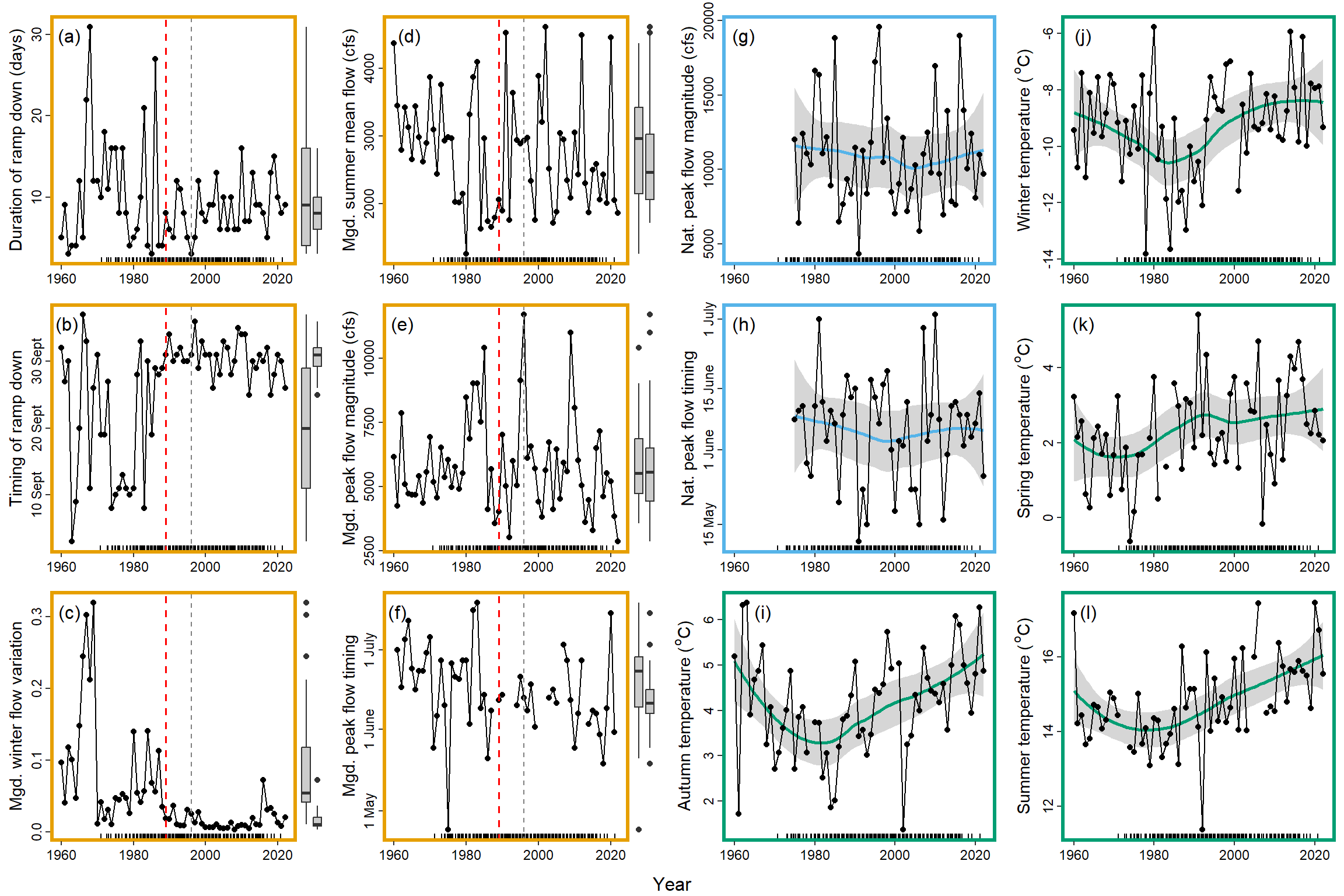
jpeg("Figures/Covariates/Covariates_TimeSeriesData_Combined.jpg", units = "in", width = 12, height = 8, res = 1500)
cp
dev.off()
png
2